Salesforce Reports and Dashboards are powerful business intelligence tools that help you make data-driven decisions for your business. They provide an easy way to access, analyze, and visualize data from Salesforce or other sources. You can also gain valuable insights into your customer relationships, sales performance, marketing efforts, and more.
With the appropriate Salesforce Reports and Dashboards in place, you’ll have the information to act quickly on any issue or opportunity.

Salesforce Reports:
Salesforce reports providing a detailed view of Salesforce data that can help you gain valuable business insights. They allow you to track and analyze data from your Salesforce platform, which you can use to make informed decisions and optimize processes for maximum efficiency. Reports enable you to create custom dashboards and visualize data in an easy-to-understand format, so you can quickly identify trends and opportunities. With Salesforce reports, you can also build out complex logic for more advanced reporting needs.
Salesforce reports features:
- Report Builder:
Report Builder allows you to create or edit reports with its visual drag-drop feature. All you need to do is select a report type, format & relevant fields, and the tool will create it for you. Launching the builder is just one click away – click the ‘New Report’ button and get started.
- Fields:
With fields, visualizing report results is a breeze. If you’re looking at one report with a table of contents, every row represents the outcome, and column represents field. When creating or editing a report, ensure to incorporate the relevant fields. It will optimize the speed of running reports, as you’re only including necessary details.
- Filters:
To ensure faster data returns, you should implement filters when reading reports. It limits data access and gives you control over the kind of information you want to see. Additionally, it’s easy to add, edit or remove any filters when looking at a report.
- Report Types:
The report type you pick influences the total number of fields your report has. For example, content reports will have fields such as ID, name, and downloads, while Account reports will have fields such as Account ID, Account name, and Phone. When creating a report, it is essential to decide its type before you begin anything else.
- Report Format:
The specific report format in Salesforce you choose will affect the way it presents the outcomes. You can select from four options – Tabular, Summary, Matrix, and Joined – with the last one not available on Lightning Experience.
Types of Salesforce reports:
In Salesforce, you can create four types of reports:
- Tabular
- Summary
- Matrix
- Joined
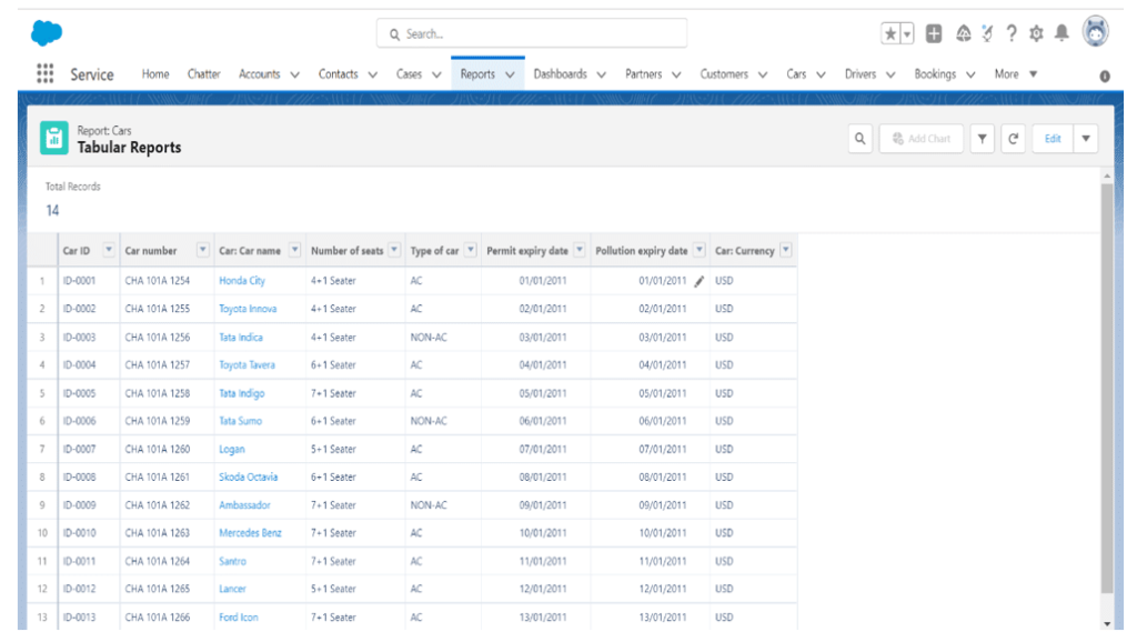
1. Tabular Reports:
- Tabular reports are an invaluable tool for data analysis. With a straightforward structure, tabular reports provide a quick and efficient way to gain meaningful insights into data sets.
- Spreadsheets offer a simple way to organize data in rows and columns. Unfortunately, they don’t allow for data grouping or advanced dashboard features, so their capabilities are limited.
- Before running a report, the user must first identify the objects from which the data is to be retrieved. It can be a single object (Opportunities/ Accounts) or a custom object.
2. Summary Reports:
- Summary reports are an upgrade from tabular reports, allowing you to categorize data points, view subtotals, and create graphical representations to present the data. They provide users with more options for organizing information and are ideal for building quality dashboards.
- Summary reports are a great way to showcase different kinds of data in an organized manner. For example, if you wish to ascertain how many or what the value of opportunities is for each account, you can group your report based on Account Name. You can also subgroup fields by moving them beneath the parent group.

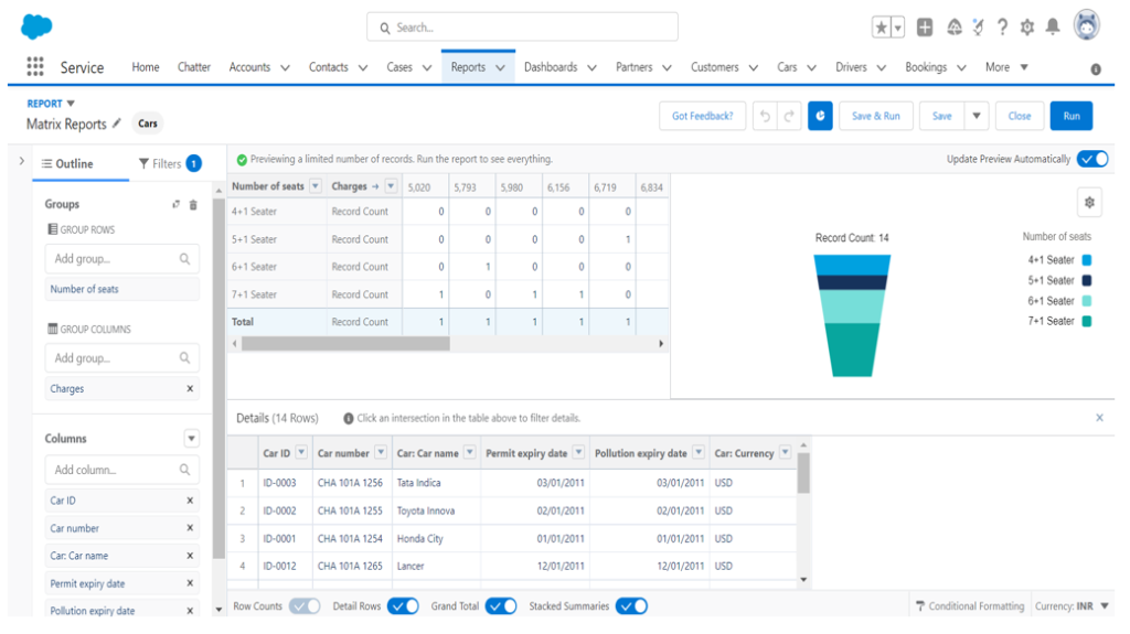
3. Matrix Reports:
- Matrix reports can be helpful when it comes to analyzing complex data sets. Although it does take longer than other report types, the amount of insight you can get from a matrix report is unparalleled.
- This kind of report allows you to group records both horizontally and vertically, giving you the most detailed view of your data.
4. Joined Reports:
- Salesforce Joined Reports are incredibly helpful and provide a unique way to manage multiple objects in one report. It allows users to combine two different report types into one, allowing them to view data from a variety of sources in an organized fashion.
- With the help of a Joined report, it is possible to create two separate reports and compare data. For instance, you could use it to present the number of opportunities and cases per account in a single view.

Salesforce Dashboards:
Salesforce Dashboards are a great way to gather all your data in one place for understanding your business operations. These dashboards provide real-time insights into customer behavior, sales performance, and more.
With the help of Salesforce Dashboards, you can easily monitor key performance indicators (KPIs) and make informed decisions based on the data presented. Moreover, Salesforce Dashboard’s best practices can help you maximize the potential of this powerful tool to get the most out of it for your business.
Salesforce Dashboard components:
- Chart:
Charts are an integral part of report data visualization. The different chart types are horizontal bar charts, vertical bar charts, line charts, pie charts, donut charts, and funnel charts.
- Gauge
Gauge components are great for illustrating a single value within a user-defined range. These ranges can represent, e.g., lower, middle, or higher values, and the reported value is plotted accordingly.
- Metric
Used to show a single value to display.
- Table
Used to show a set of report data in column form.
- Visualforce page
Visualforce components offer a great way to display data that may not be available through the standard dashboard component types. You can use it to create custom components to tailor your data presentation according to your preferences.
How to Create a Salesforce Dashboard?
- Navigate to “Reports”
- Click “New Dashboard”
- Set the running user (by default, it is the user creating the report)
- “Drag and drop” the components and data sources into the dashboard builder
Note: To modify any component, you can click on the wrench icon to launch the component editor.
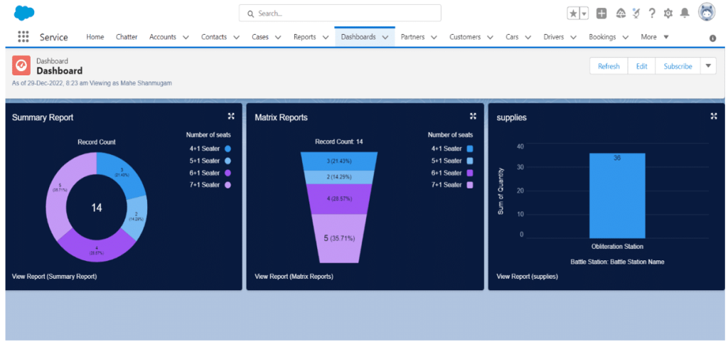
As mentioned above, here is a dashboard for summary and Matrix reports using the donut chart and Funnel type chart.
With the help of Salesforce reports and dashboards, businesses can easily measure their performance and identify areas of improvement. Moreover, leveraging reports in Salesforce allows companies to gain valuable insights about their customers, which you can use for targeted marketing campaigns. Thus, using Salesforce Reports and Dashboards is a great way for businesses to optimize their operations and increase profits.
Subscribe to blogs
Get our latest blogs directly to your inbox.