HTML emails are one of the most effective channels for digital marketing. But the biggest challenge for people building HTML email templates is making the content responsive and usable on any screen size and browser, which “Media Queries” can handle. With the rising popularity of responsive emails, Media queries play a vital role in HTML emails.
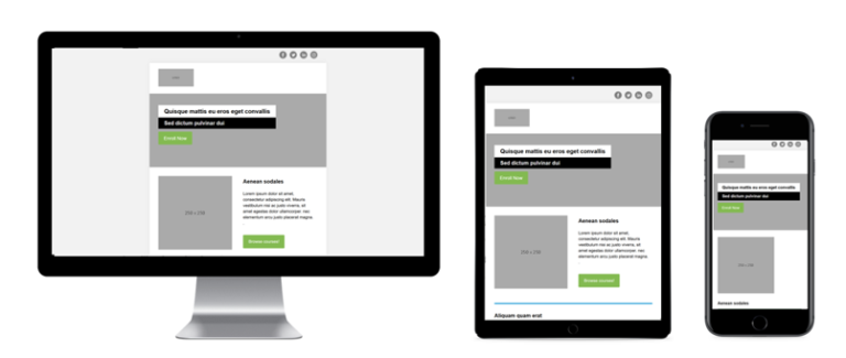
What are Media Queries?
Media queries are part of the Cascading Style Sheets (CSS). It allows you to deliver carefully tailored content to different screen sizes, orientations, or resolutions.
A media query can support different media types like desktops, laptops, mobile phones (iPhone and Android devices), tablets, etc.
Use media query to check the following factors:
- width and height of the viewport or device
- Orientation (landscape or portrait mode)
- Resolution
Media Query Syntax

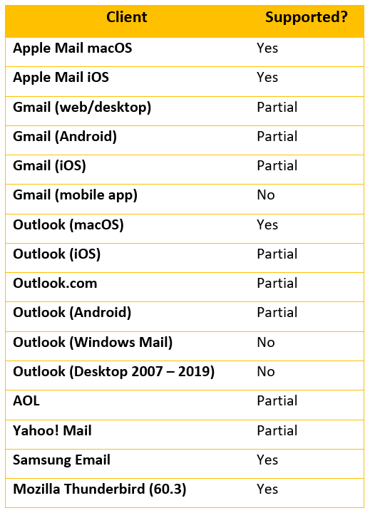
Email clients that support media queries
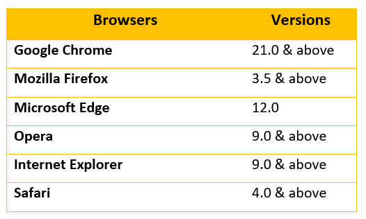
Browsers that support media queries
Media Query Parts
A media query consists of 3 Parts:
1. Media Type: Allows to declare what type of media the rules should be applied to. There are four options to use:
- all – Used for all media devices.
- print – Used for controlling the printed output of a webpage.
- screen – Used for Computer screens, mobile screens, and so on.
- speech– Used for screen readers (to read screen aloud).
2. Expressions: This allows you to target devices based on some criteria to pass the media query. Use Expressions to test media features, such as the width and height of the target devices.
3. CSS Style Rules: It defines how HTML elements should be displayed on a webpage. It comes inside the curly braces of the media query.
How does Media Query work?
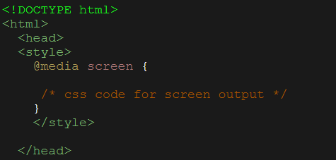
CSS Media query consist of at least one media type and zero or more expressions called media features. Media queries are defined by “@media” in the style block.
1. Querying media types by media queries
CSS is defined based on media types for the output devices. For a blank media type in media queries, the default value “all” applies automatically. The most common values of media types are all, print, screen, and speech.
2. Querying media features by media queries
Media features must meet the requirements set for an output device to include the CSS resources. Media features include width, height, resolution, and orientation of a display.
Use “min-width & max-width” media features to target devices with known widths.
- max-width: The max-width property defines the maximum width of the browser window in pixels.
- min-width: The min-width property defines the minimum width of the browser window in pixels.
Example: The following media query will trigger the styles and make them responsive only for screen sizes between 380px & 600px.

3. Media queries for different breakpoints
A breakpoint is a condition used to set the appropriate display sizes for the respective viewports. As a result, the layout of an email changes a particular display size. Here, CSS overwrites the existing styles with the breakpoint conditions mentioned.

A viewport meta tag is integrated into the head section of the HTML code to make the correct display on every device.
This meta-tag handles the dimensions and scaling of the browser page.

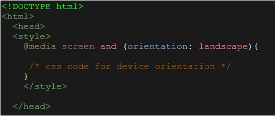
4. Media queries for device orientation
To target device orientation, use Media queries. The orientation property defines whether the screen is in portrait or landscape mode.
Example: An email with two or more column layouts might work in a phone or tablet in landscape mode. But it will not work in portrait mode. To overcome this, use a media query with an orientation feature to make the email responsive by stacking the columns one above another in portrait mode.
5. Using Media Queries to target Yahoo emails
Use media query to target Yahoo email clients and address the rendering issues in the yahoo emails. The styles added will trigger only in Yahoo emails.

6. Using media queries for dark mode emails
While viewing emails in devices with dark mode, some email clients don’t change the email design. It can lead to a poor email experience or inverting the colors of the email.
To overcome the above scenario, use Media query by displaying different designs for dark.

The email design and layout are the most critical factors for a successful email campaign. It’s a must to make sure your emails are responsive and look great on all devices.
Media Queries in HTML Emails is a great way for email marketers to optimize their emails and make them responsive for various devices. It is an important aspect to be considered for better email marketing campaigns.
However, email clients are regularly updating their systems, and some email features might not work in some email clients. So, testing is the only solution to make email better without any issues before sending it to users.
Subscribe to blogs
Get our latest blogs directly to your inbox.

